Friday, September 25, 2020

Magenta Super Saturday - Stenciled Leaves


Welcome back to Magenta Super Saturday and thank you for visiting my blog today.

I’m playing with shaving cream again and I thought it would be fun to try this technique with stencils.  A few weeks ago, I made some background papers with shaving cream and Magenta Nuance.  You can see that post here.  I thought it might be fun to try using stencils with the shaving cream in order to isolate the swirly patterns within the designs of a stencil.  

This time I used alcohol inks instead of Nuance.  (I think you could also mix some Nuance powders with a small amount of water to make the colors very concentrated, then use them in the same way I used the alcohol inks.) You can also see my card on the Magenta blog here.

I sprayed the shaving cream onto a disposable baking sheet, then added drops of Sunset Orange, Sunset Yellow, Valencia and Terra Cotta alcohol inks.  I used a palette knife to mix the colors a bit then gently laid the Sweet Leaves stencil on the top of the shaving cream.


I placed a piece of 80# Neenah white cardstock on top of the stencil then gently pushed both pieces down into the shaving cream - I wanted to be sure the cream came in contact with all the open spots on the stencil.  The paper absorbs the color very quickly. I slowly lifted both the paper and stencil from the shaving cream and laid them on my work surface.  I gently lifted the stencil from the paper, used a straight edged tool to remove the shaving cream from the card stock, then wiped the cardstock with a dry towel to remove any remaining shaving cream.  (If there are any areas that don’t have shaving cream on them when you lift the paper and stencil from the shaving cream, just use your palette knife to scoop up some cream and place it on the empty spot. Let it sit for a bit then remove all the shaving cream.)  


It took me a few tries to come up with the process I liked.  I realized that the most vibrant colors came from the first use of the shaving cream after the ink had been applied.  Although you can re-use the shaving cream many, many times, the colors start blending and the colors get softer and lighter.  I also discovered that I wanted some color in my background.  On the final piece for today I blended some Scattered Straw and Dried Marigold Distress ink over the cardstock, let it dry, then proceeded with the shaving cream process.


After my pieces were dry, I decided I wanted to emphasize the leaves just a little bit more.  I lined up the stencil over the leaves then used a dauber brush to apply Distress Abandoned Coral around the edges of the leaves.


O
n another piece, I put one of the stenciled pieces back into the shaving cream after the colors had lightened and blended some.  This also gave an interesting result.  

I stamped the sentiment onto a piece of white cardstock with VersaFine Sepia ink and embossed with clear embossing powder.  I used a bit of Scattered Straw and Dried Marigold Distress ink around the edges of the sentiment.  I matted the card front and sentiment on pieces of reddish-brown cardstock.  After the card was assembled, I added a few sequins for a bit of sparkle.

Thanks for visiting my blog today. 

Magenta Products Used

07.970.G - All you Need is Love 

TM320 - Sweet Leaves

Other Products Used

Ranger Alcohol Inks (Sunset Orange, Sunset Yellow, Valencia, Terra Cotta)

Distress Inks (Scattered Straw, Abandoned Coral, Dried Marigold)

VersaFine Ink (Sepia)

Judikins Clear Embossing Powder

I-Crafter I-Brush Ink Applicator Brushes

Barbasol Shaving Cream


Thursday, September 10, 2020

An Experiment with Acrylic Pouring

Hi everyone. Thanks for visiting my blog today. My grandson, Shane, and I have started a YouTube channel called "Lady and the Stamp". Shane is the director and video editor and we've been having a lot of fun creating these videos. 
This is a close-up of the canvas created in the video.  This was poured onto an 8"x8" canvas.
I have always wanted to try acrylic pouring. You can find hundreds and hundreds of videos about this on YouTube. Honestly, I've spent way too much time watching the videos but one day I stumbled across a video where they did acrylic pouring on rocks. I was fascinated and decided I had to try it. Many people hide painted rocks in our local parks so I thought this might be a good use for the finished products. 


It's a fairly simple process and I bought many of my supplies at my local Dollar Store. We picked up rocks in a variety of shapes and sizes. My local Michaels was also had a sale on painting canvas. You need acrylic paint, plastic mixing cups, stir sticks, aluminum foil, a cookie sheet or something similar to place your items on when pouring, pouring medium and silicone. You will probably want to wear rubber gloves, also. 

I soaked the rocks overnight in water with a tiny amount of bleach to kill any mold or moss, then rinsed them thoroughly and let them dry for another full day. I painted them with white acrylic paint but this is optional. I found that I liked the way the colors popped on the rocks with a white coating but it was fun to try on unpainted rocks, also. (I’m going to experiment with black rocks next.) 
Both of these rocks were poured from the same cup of paint.  The colors vary by how the paint mixes as it is poured.

You can see the ball of foil that acts as a stand for the rock while the paint dries.

The pouring medium is used to thin the paint without changing the color. I purchased Floetrol from Amazon; however, you can also mix white liquid glue (such as Elmer’s) in a ratio of about 70% glue and 30% water (preferably distilled water), and then use this mixture to thin your paint. When you mix your paints and pouring medium, you want to obtain the consistency of buttermilk – if it’s too thick, it will be hard to pour. 

As an option, I also used silicone drops, such as the type you use for a treadmill, in one of my paints. I also ordered this from Amazon, but if you have a silicone spray like WD-40 (the silicone variety), you can also spray that into your paint mixture. This is totally optional, but it does add an interesting texture to the finished piece. 
This was the first attempt - poured onto a 4" x 4" canvas.

My granddaughter picked the colors for my second attempt. This was poured onto an 8" x 8" canvas.

This was so much fun to do so I hope you will consider giving it a try. If you liked our video, I hope you will subscribe to our channel and give us a thumbs up. Thanks for visiting and watching our video.

Friday, September 4, 2020

Magenta Super Saturday - Mandala Slimline Card

Welcome back to Magenta Super Saturday and thank you for visiting my blog.  Slimline cards are really popular right now so I decided to make one for today’s post.  I used the Flower Mandala Background stamp and my stamp positioner.  I planned to stamp, then color with colored pencils, then re-stamp the image and emboss with gold embossing powder.  You can also see my card on the Magenta blog here

To make the layout for this card work, I had to do some math and some experimenting.  Since I wanted the stamped design to be centered I realized that I needed to cut the cardstock for the stamped image the same width as the stamp.  To begin, I cut a piece of 80# white cardstock to measure 4 ½” x 10 ¼”.  (This is the width of the stamp and twice the length of the stamp.)  


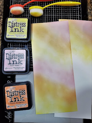
I blended Squeezed Lemonade, Spun Sugar and Dried Marigold Distress inks over the entire piece.  I also blended these same inks on a scrap of cardstock to use later for the sentiment.  

After the inks had dried, I placed the cardstock in the corner of my stamp positioner and stamped with VersaFine Toffee ink.  I rotated the paper and stamped the image again.  The bottom edges of the stamped images will almost touch in the middle of the piece of cardstock.

I colored all the mandalas with colored pencils (the colors I used are listed below), then returned the cardstock to my stamp positioner.  I used a powder tool over the entire piece, stamped with VersaMark, then embossed with Brutus Monroe Gilded Gold embossing powder.  I also stamped the thank you sentiment, embossed with gold embossing powder and cut it out with a 2” circle die.

To assemble the card, I began with the card base.  The final size of the card is 4” x 9”.  I cut the base cardstock to 8” x 9”, then scored and folded in half.  I cut a piece of orange cardstock to 3 ¾” x 8 ¾” and also cut a 2 ¼” circle for the backing of the sentiment.  The final size of the mandala piece is 3 ½” x 8 ½”, however, in order for the design to remain centered I cut equal amounts from each side of the piece.  I cut ½” from each long size and 7/8” from each end.  After assembling I added a few sequins for a bit of sparkle. 

Here are the final measurements:

Base card:  8"x9", scored and folded in half at 4" to make a card that measures 4" x 9"; Matting cardstock: 3 3/4" x 8 3/4"; Stamped image:  Original size was 4 1/2" x 1- 1/4", then cut to 3 1/2" x 8 1/2".

One note, I used 110# cardstock for my card base but this made the card weigh more than one ounce which increases the postage when you mail the card.  Using 80# cardstock will decrease the weight and should keep it under one ounce. 

If your stamp positioner can’t accommodate a longer piece of cardstock, you can skip the second stamping step.  


I also created some other panels with Distress inks and Distress Oxide inks.  Going left to right on the picture above I used I used Distress Oxide in Peacock Feathers, Evergreen Bough and Twisted Citron. When the ink was dry, I stamped and embossed with gold embossing powder, then used a Wink of Stella pen to color the mandalas for a bit of sparkle.  For the next panel I used Distress Shaded Lilac and Tumbled glass then colored with pencils (the colors are listed below) and embossed with gold embossing powder.  The middle panel is the one I used for today's card.  For the fourth panel I stamped my image, then used small blending brushes to shade the mandalas with Distress Oxide Picked Raspberry and Wilted Violet, then colored the open areas with Spun Sugar. When the ink was dry I restamped the image and embossed with gold embossing powder.  On the last panel, I blended Distress Oxide Twisted Citron, Evergreen Bough and Lucky Clover inks over the entire panel and when the ink was dry, I stamped and embossed with gold embossing powder.  I again used a clear Wink of Stella pen to apply sparkle on the Mandalas.  

This was a fun project and I ended up with several panels for more slimline cards.  I hope you will give it a try. Thanks for visiting my blog today.  

Magenta Products Used

0772.R
07.979.G


Other Products Used

Prismacolor Pencils (Panel 1: Carmine Red PC926; Yellowed Orange PC1002; Pale Vermillion PC921; Crimson Red PC924; Permanent Red PC122; Spanish Orange PC1003) (Panel 2: China Blue PC1100; Lilac PC956; True Blue PC903; Violet Blue PC933; Imperial Violet PC1007; Peacock Blue PC1027)

Distress Inks

Distress Oxide Inks

VersaMark Ink

Brutus Monroe Gilded Gold Embossing Powder

Wink of Stella